Dalla tela all’armadio: la lezione cromatica di Rothko

by Francesca Delogu

In front of a Rothko you stand in silence, in a kind of sensory overload, immersive and disorienting. The colours brush against each other, contradict each other and surprise each other: an unstable interplay with an expressive force that no “cautious” combination could achieve.

Until 23 August, the Palazzo Strozzi in Florence hosts one of the most important exhibitions ever dedicated to the Latvian-born American artist: 70 works spanning four decades of research. The master of Colour Field Painting, who committed suicide in New York in 1970 at the age of 66, used colour to open up within the viewer an inner space made up of pure, almost physical emotions.

Like giant scarves, his monumental paintings are suspended rectangles with vibrating edges: they pause on an indefinite threshold, as though they were breathing. It is precisely within that suspension that they act on the nervous system and the mind, with the same power of certain musical chords.

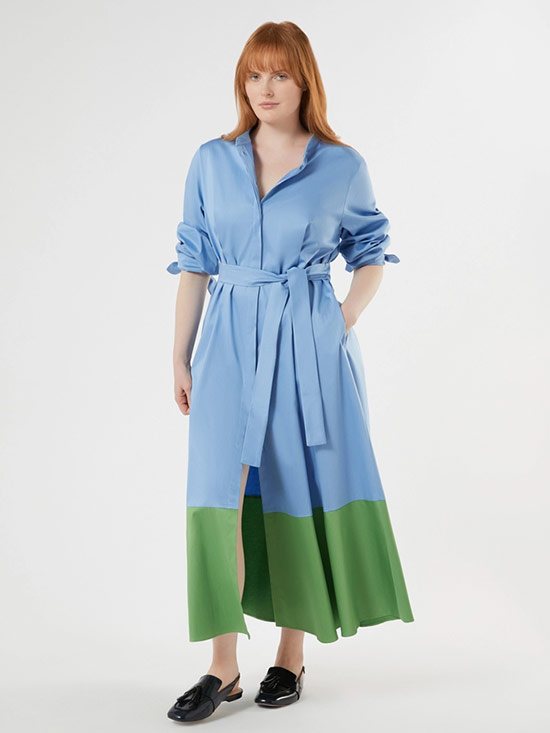
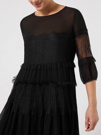
But looking beyond the history of art, how will the way we dress change after looking at colour in this way? It is natural to wonder whether the ripple-effect of this experience is already changing something in the way we evaluate the tonalities of the jackets, trousers and dresses we choose to wear.

MARINA RINALDI TEXT MEDIA TEXT B DESKTOP 800x1066 1 Marina Rinaldi

How to choose colours that suit us

For a long time, we have approached matching colours as a discipline based on predictable harmony: the reassuring tone on tone, the neutral as a safe haven from mistakes, the obedient colour wheel. Rules that have produced impeccable wardrobes and perfect coordination, but often lacking in expression.


Faced with a Rothko however, this idea fractures: colours remain in tension. So why not try a different approach? Even in your everyday life, view your wardrobe as an area of experimentation and possibilities. For example: start with two colours that you would never choose to go together, step out of the “comfort zone”. Reds alongside pinks, warm browns against terracotta oranges, wisteria in dialogue with ochre.


Prioritising bold colour combinations can become an act of reclaiming, a key to revealing our emotional state. Rothko explicitly asked this of anyone who approached his canvases. “I don’t want people to appreciate the colour or shape,” he wrote. “I’d like them to be moved”. 


In 1950 he visited Florence with his wife Mell on a trip that would leave an indelible mark on his imagination: this encounter with the 15th- and 16th-century masters stayed with him throughout his life, fuelling that semi-sacred chromatic dimension that would mark his artistic maturity.


In Rothko’s paintings, a burnt orange may follow purple, in an interaction that generates force precisely because neither colour yields to the other. It’s what colour theorists call resonance, and anyone who has spent twenty minutes in front of one of his large paintings has experienced it, without the need for definitions. 

MARINA RINALDI EDITORIAL COVER A DESKTOP 800x910 Marina Rinaldi MARINA RINALDI EDITORIAL COVER A DESKTOP 550x733 Marina Rinaldi

Light blue, green, ochre: make way for contrasts

Contemporary fashion is coming to the same conclusions as Rothko. It’s probably no coincidence that it is happening right now, in a time of uncertainty when we increasingly feel the need to inhabit our bodies with honesty. The colour we pick in the morning is the first statement of the day: a glowing orange because it  warms us from the inside, a deep blue to find presence, a moss green to feel rooted.


This season, the palette opens up, it oxygenates: powder blue meets vegetal green, pop pink interrupts the calm with unexpected irony, purple becomes more fluid, less defined. In the latest collections, some combinations already seem to be designed like miniature painterly compositions. At other times, it is we who compose the emotional language. We can step outside the usual boundaries, pairing pop pink with burnt orange, ochre with green, creating more instinctive and personal contrasts.

Just like in front of a Rothko canvas, we look for harmony: what resonates? What does it really have to do with us? Every daily gesture, even the simplest - opening the wardrobe and picking something to wear - becomes a moment of listening and discovery, a small exercise with surprising consequences. Rothko understood it. Maybe it’s time for us to learn it too.

“Rothko in Florence”, Fondazione Palazzo Strozzi, from 14 March to 23 August 2026. With special sections at the San Marco Museum and the Biblioteca Medicea Laurenziana